6 Layout, themes, HTML
6.1 Introduction
In this chapter you’ll unlock some new tools for controlling the overall appearance of your app. We’ll start by talking about page layouts (both single and “multiple”) that let you organise your inputs and outputs. Then you’ll learn about Bootstrap, the CSS toolkit that Shiny uses, and how to customise its overall visual appearance with themes. We’ll finish with a brief discussion of what’s going on under the hood so that if you know HTML and CSS you can customise Shiny apps still further.
6.2 Single page layouts
In Chapter 2 you learned about the inputs and outputs that form the interactive components of the app.
But I didn’t talk about how to lay them out on the page, and instead I just used fluidPage() to slap them together as quickly as possible.
While this is fine for learning Shiny, it doesn’t create usable or visually appealing apps, so now it’s time to learn some more layout functions.
Layout functions provide the high-level visual structure of an app. Layouts are created by a hierarchy of function calls, where the hierarchy in R matches the hierarchy in the generated HTML. This helps you understand layout code. For example, when you look at layout code like this:
fluidPage(
  titlePanel("Hello Shiny!"),
  sidebarLayout(
    sidebarPanel(
      sliderInput("obs", "Observations:", min = 0, max = 1000, value = 500)
    ),
    mainPanel(
      plotOutput("distPlot")
    )
  )
)
Focus on the hierarchy of the function calls:
fluidPage(
  titlePanel(),
  sidebarLayout(
    sidebarPanel(),
    mainPanel()
  )
)
Even though you haven’t learned these functions yet, you can guess what’s going on by reading their names. You might imagine that this code will generate a classic app design: a title bar at top, followed by a sidebar (containing a slider) and main panel (containing a plot). The ability to easily see hierarchy through indentation is one of the reasons it’s a good idea to use a consistent style.
In the remainder of this section I’ll discuss the functions that help you design single-page apps, then moving on to multi-page apps in the next section. I also recommend checking out the Shiny Application layout guide; it’s a little dated but contains some useful gems.
6.2.1 Page functions
The most important, but least interesting, layout function is fluidPage(), which you’ve seen in pretty much every example so far.
But what’s it doing and what happens if you use it by itself?
Figure 6.1 shows the results: it looks like a very boring app but there’s a lot going behind the scenes, because fluidPage() sets up all the HTML, CSS, and JavaScript that Shiny needs.
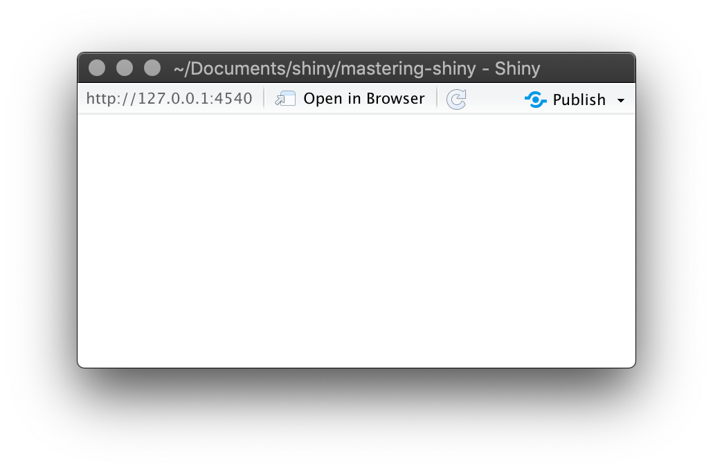
Figure 6.1: An UI consisting only of fluidPage()
In addition to fluidPage(), Shiny provides a couple of other page functions that can come in handy in more specialised situations: fixedPage() and fillPage().
fixedPage() works like fluidPage() but has a fixed maximum width, which stops your apps from becoming unreasonably wide on bigger screens.
fillPage() fills the full height of the browser and is useful if you want to make a plot that occupies the whole screen.
You can find the details in their documentation.
6.2.2 Page with sidebar
To make more complex layouts, you’ll need call layout functions inside of fluidPage().
For example, to make a two-column layout with inputs on the left and outputs on the right you can use sidebarLayout() (along with its friends titlePanel(), sidebarPanel(), and mainPanel()).
The following code shows the basic structure to generate Figure 6.2.
fluidPage(
  titlePanel(
    # app title/description
  ),
  sidebarLayout(
    sidebarPanel(
      # inputs
    ),
    mainPanel(
      # outputs
    )
  )
)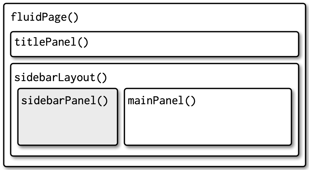
Figure 6.2: Structure of a basic app with sidebar
To make it more realistic, lets add an input and output to create a very simple app that demonstrates the Central Limit Theorem, as shown in Figure 6.3. If you run this app yourself, you can increase the number of samples to see the distribution become more normal.
ui <- fluidPage(
  titlePanel("Central limit theorem"),
  sidebarLayout(
    sidebarPanel(
      numericInput("m", "Number of samples:", 2, min = 1, max = 100)
    ),
    mainPanel(
      plotOutput("hist")
    )
  )
)
server <- function(input, output, session) {
  output$hist <- renderPlot({
    means <- replicate(1e4, mean(runif(input$m)))
    hist(means, breaks = 20)
  }, res = 96)
}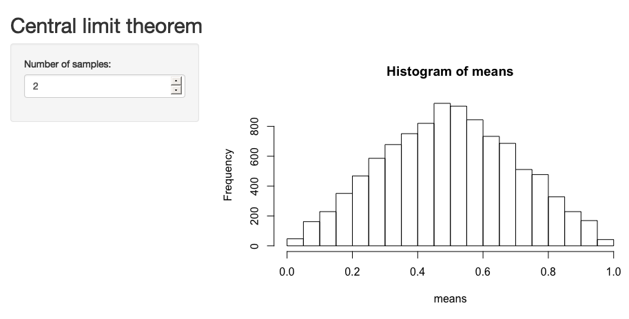
Figure 6.3: A common app design is to put controls in a sidebar and display results in the main panel
6.2.3 Multi-row
Under the hood, sidebarLayout() is built on top of a flexible multi-row layout, which you can use directly to create more visually complex apps.
As usual, you start with fluidPage().
Then you create rows with fluidRow(), and columns with column().
The following template generates the structure shown in Figure 6.4.
fluidPage(
  fluidRow(
    column(4,
      ...
    ),
    column(8,
      ...
    )
  ),
  fluidRow(
    column(6,
      ...
    ),
    column(6,
      ...
    )
  )
)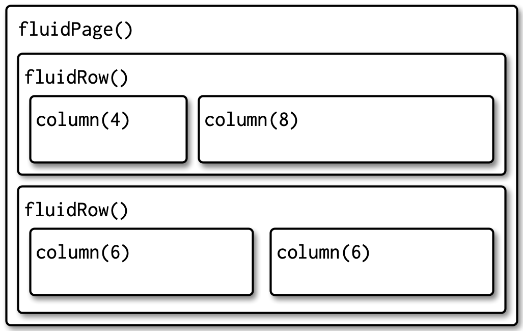
Figure 6.4: The structure underlying a simple multi-row app
Each row is made up of 12 columns and the first argument to column() gives how many of those columns to occupy.
A 12 column layout gives you substantial flexibility because you can easily create 2-, 3-, or 4-column layouts, or use narrow columns to create spacers.
You can see an example of this layout in Section 4.4.
If you’d like to learn more about designing using a grid system, I highly recommend the classic text on the subject: “Grid systems in graphic design” by Josef Müller-Brockman.
6.2.4 Exercises
Read the documentation of
sidebarLayout()to determine the width (in columns) of the sidebar and the main panel. Can you recreate its appearance usingfluidRow()andcolumn()? What are you missing?Modify the Central Limit Theorem app to put the sidebar on the right instead of the left.
Create an app with that contains two plots, each of which takes up half of the width. Put the controls in a full width container below the plots.
6.3 Multi-page layouts
As your app grows in complexity, it might become impossible to fit everything on a single page.
In this section you’ll learn various uses of tabPanel() that create the illusion of multiple pages.
This is an illusion because you’ll still have a single app with a single underlying HTML file, but it’s now broken into pieces and only one piece is visible at a time.
Multi-page apps pair particularly well with modules, which you’ll learn about in Chapter 19. Modules allow you to partition up the server function in the same way you partition up the user interface, creating independent components that only interact through well defined connections.
6.3.1 Tabsets
The simple way to break up a page into pieces is to use tabsetPanel() and its close friend tabPanel().
As you can see in the code below, tabsetPanel() creates a container for any number of tabPanels(), which can in turn contain any other HTML components.
Figure 6.5 shows a simple example.
ui <- fluidPage(
  tabsetPanel(
    tabPanel("Import data",
      fileInput("file", "Data", buttonLabel = "Upload..."),
      textInput("delim", "Delimiter (leave blank to guess)", ""),
      numericInput("skip", "Rows to skip", 0, min = 0),
      numericInput("rows", "Rows to preview", 10, min = 1)
    ),
    tabPanel("Set parameters"),
    tabPanel("Visualise results")
  )
)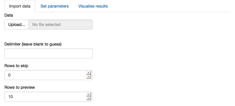
Figure 6.5: A tabsetPanel() allows the user to select a single tabPanel() to view
If you want to know what tab a user has selected, you can provide the id argument to tabsetPanel() and it becomes an input.
Figure 6.6 shows this in action.
ui <- fluidPage(
  sidebarLayout(
    sidebarPanel(
      textOutput("panel")
    ),
    mainPanel(
      tabsetPanel(
        id = "tabset",
        tabPanel("panel 1", "one"),
        tabPanel("panel 2", "two"),
        tabPanel("panel 3", "three")
      )
    )
  )
)
server <- function(input, output, session) {
  output$panel <- renderText({
    paste("Current panel: ", input$tabset)
  })
}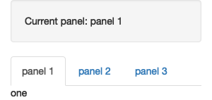
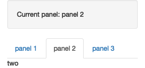
Figure 6.6: A tabset becomes an input when you use the id argument. This allows you to make your app behave differently depending on which tab is currently visible.
Note tabsetPanel() can be used anywhere in your app; it’s totally fine to nest tabsets inside of other components (including tabsets!) if needed.
6.3.2 Navlists and navbars
Because tabs are displayed horizontally, there’s a fundamental limit to how many tabs you can use, particularly if they have long titles.
navbarPage()and navbarMenu() provide two alternative layouts that let you use more tabs with longer titles.
navlistPanel() is similar to tabsetPanel() but instead of running the tab titles horizontally, it shows them vertically in a sidebar.
It also allows you to add headings with plain strings, as shown in the code below, which generates Figure 6.7.
ui <- fluidPage(
  navlistPanel(
    id = "tabset",
    "Heading 1",
    tabPanel("panel 1", "Panel one contents"),
    "Heading 2",
    tabPanel("panel 2", "Panel two contents"),
    tabPanel("panel 3", "Panel three contents")
  )
)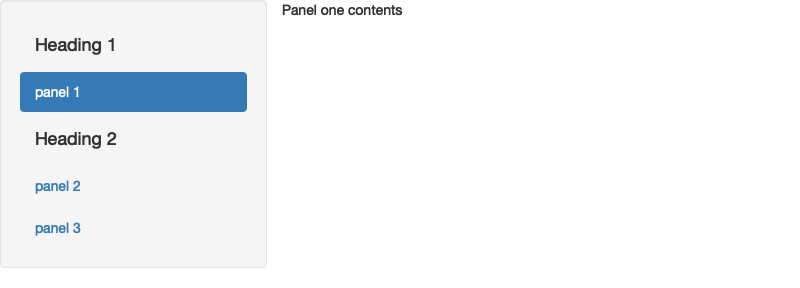
Figure 6.7: A navlistPanel() displays the tab titles vertically, rather than horizontally.
Another approach is use navbarPage(): it still runs the tab titles horizontally, but you can use navbarMenu() to add drop-down menus for an additional level of hierarchy.
Figure 6.8 shows a simple example.
ui <- navbarPage(
  "Page title",
  tabPanel("panel 1", "one"),
  tabPanel("panel 2", "two"),
  tabPanel("panel 3", "three"),
  navbarMenu("subpanels",
    tabPanel("panel 4a", "four-a"),
    tabPanel("panel 4b", "four-b"),
    tabPanel("panel 4c", "four-c")
  )
)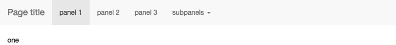
Figure 6.8: A navbarPage() sets up a horizontal nav bar at the top of the page.
These layouts give you considerable ability to create rich and satisfying apps. To go further, you’ll need to learn more about the underlying design system.
6.4 Bootstrap
To continue your app customisation journey, you’ll need to learn a little more about the Bootstrap framework used by Shiny.
Bootstrap is a collection of HTML conventions, CSS styles, and JS snippets bundled up into a convenient form.
Bootstrap grew out of a framework originally developed for Twitter and over the last 10 years has grown to become one of the most popular CSS frameworks used on the web.
Bootstrap is also popular in R — you’ve undoubtedly seen many documents produced by rmarkdown::html_document() and used many package websites made by pkgdown, both of which also use Bootstrap.
As a Shiny developer, you don’t need to think too much about Bootstrap, because Shiny functions automatically generate bootstrap compatible HTML for you. But it’s good to know that Bootstrap exists because then:
You can use
bslib::bs_theme()to customise the visual appearance of your code, Section 6.5.You can use the
classargument to customise some layouts, inputs, and outputs using Bootstrap class names, as you saw in Section 2.2.7.You can make your own functions to generate Bootstrap components that Shiny doesn’t provide, as explained in “Utility classes”.
It’s also possible to use a completely different CSS framework. A number of existing R packages make this easy by wrapping popular alternatives to Bootstrap:
shiny.semantic, by Appsilon, builds on top of Fomantic UI.
shinyMobile, by RInterface, builds on top of framework 7, and is specifically designed for mobile apps.
shinymaterial, by Eric Anderson, is built on top of Google’s Material design framework.
shinydashboard, also by RStudio, provides a layout system designed to create dashboards.
You can find a fuller, and actively maintained, list at https://github.com/nanxstats/awesome-shiny-extensions.
6.5 Themes
Bootstrap is so ubiquitous within the R community that it’s easy to get style fatigue: after a while every Shiny app and Rmd start to look the same. The solution is theming with the bslib package. bslib is relatively new package that allows you to override many Bootstrap defaults in order to create an appearance that is uniquely yours. As I write this, bslib is mostly applicable only to Shiny, but work is afoot to bring its enhanced theming power to RMarkdown, pkgdown, and more.
If you’re producing apps for your company, I highly recommend investing a little time in theming — theming your app to match your corporate style guide is an easy way to make yourself look good.
6.5.1 Getting started
Create a theme with bslib::bs_theme() then apply it to an app with the theme argument of the page layout function:
If not specified, Shiny will use the classic Bootstrap v3 theme that it has used basically since it was created.
By default, bslib::bs_theme(), will use Bootstrap v5.
Using Bootstrap v5 instead of v3 will not cause problems if you only use built-in components.
There is a possibility that it might cause problems if you’ve used custom HTML, so you can force it to stay with v3 with version = 3.
6.5.2 Shiny themes
The easiest way to change the overall look of your app is to pick a premade “bootswatch” theme using the bootswatch argument to bslib::bs_theme().
Figure 6.9 shows the results of the following code, switching "darkly" out for other themes.
ui <- fluidPage(
  theme = bslib::bs_theme(bootswatch = "darkly"),
  sidebarLayout(
    sidebarPanel(
      textInput("txt", "Text input:", "text here"),
      sliderInput("slider", "Slider input:", 1, 100, 30)
    ),
    mainPanel(
      h1(paste0("Theme: darkly")),
      h2("Header 2"),
      p("Some text")
    )
  )
)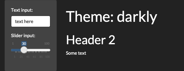
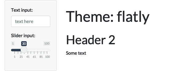
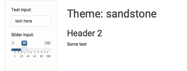
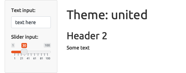
Figure 6.9: The same app styled with four bootswatch themes: darkly, flatly, sandstone, and united
Alternatively, you can construct your own theme using the other arguments to bs_theme() like bg (background colour), fg (foreground colour) and base_font20:
theme <- bslib::bs_theme(
  bg = "#0b3d91",
  fg = "white",
  base_font = "Source Sans Pro"
)
An easy way to preview and customise your theme is to use bslib::bs_theme_preview(theme).
This will open a Shiny app that shows what the theme looks like when applied to many standard controls, and also provides you with interactive controls for customising the most important parameters.
6.5.3 Plot themes
If you’ve heavily customised the style of your app, you may want to also customise your plots to match.
Luckily, this is really easy thanks to the thematic package which automatically themes ggplot2, lattice, and base plots.
Just call thematic_shiny() in your server function.
This will automatically determine all of the settings from your app theme as in Figure 6.10.
library(ggplot2)

ui <- fluidPage(
  theme = bslib::bs_theme(bootswatch = "darkly"),
  titlePanel("A themed plot"),
  plotOutput("plot"),
)

server <- function(input, output, session) {
  thematic::thematic_shiny()

  output$plot <- renderPlot({
    ggplot(mtcars, aes(wt, mpg)) +
      geom_point() +
      geom_smooth()
  }, res = 96)
}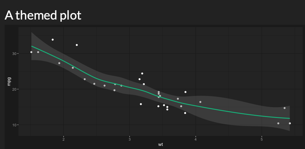
Figure 6.10: Use thematic::thematic_shiny() ensures that the ggplot2 automatically matches the app theme
6.5.4 Exercises
- Use
bslib::bs_theme_preview()to make the ugliest theme you can.
6.6 Under the hood
Shiny is designed so that, as an R user, you don’t need to learn about the details of HTML. However, if you know some HTML and CSS, it’s possible to customise Shiny still further. Unfortunately teaching HTML and CSS is out scope for this book, but a good place to start are the HTML and CSS basics tutorials by MDN.
The most important thing to know is that there’s no magic behind all the input, output, and layout functions: they just generate HTML21. You can see that HTML by executing UI functions directly in the console:
<div class="container-fluid">
  <div class="form-group shiny-input-container">
    <label for="name">What's your name?</label>
    <input id="name" type="text" class="form-control" value=""/>
  </div>
</div>
Note that this is the contents of the <body> tag; other parts of Shiny take care of generating the <head>.
If you want to include additional CSS or JS dependencies you’ll need to learn htmltools::htmlDependency().
Two good places to start are https://blog.r-hub.io/2020/08/25/js-r/#web-dependency-management and https://unleash-shiny.rinterface.com/htmltools-dependencies.html.
It’s possible to add your own HTML to the ui.
One way to do so is by including literal HTML with the HTML() function.
In the example below, I use the “raw character constant22”, r"()", to make it easier to include quotes in the string:
ui <- fluidPage(
  HTML(r"(
    <h1>This is a heading</h1>
    <p class="my-class">This is some text!</p>
    <ul>
      <li>First bullet</li>
      <li>Second bullet</li>
    </ul>
  )")
)
If you’re a HTML/CSS expert, you might be interested to know that you can skip fluidPage() altogether and supply raw HTML.
See “Build your entire UI with HTML” for more details.
Alternatively, you can make use of the HTML helper that Shiny provides.
There are regular functions for the most important elements like h1() and p(), and all others can be accessed via the other tags helper.
Named arguments become attributes and unnamed arguments become children, so we can recreate the above HTML as:
ui <- fluidPage(
  h1("This is a heading"),
  p("This is some text", class = "my-class"),
  tags$ul(
    tags$li("First bullet"),
    tags$li("Second bullet")
  )
)
One advantage of generating HTML with code is that you can interweave existing Shiny components into a custom structure. For example, the code below makes a paragraph of text containing two outputs, one which is bold:
tags$p(
  "You made ",
  tags$b("$", textOutput("amount", inline = TRUE)),
  " in the last ",
  textOutput("days", inline = TRUE),
  " days "
)
Note the use of inline = TRUE; the textOutput() default is to produe a complete paragraph.
To learn more about using HTML, CSS, and JavaScript to make compelling user interfaces, I highly recommend David Granjon’s Outstanding User Interfaces with Shiny.
6.7 Summary
This chapter has given you the tools you need to make complex and attractive Shiny apps.
You’ve learned the Shiny functions that allow you to layout single and multi-page apps (like fluidPage() and tabsetPanel()) and how to customise the overall visual appearance with themes.
You’ve also learned a little bit about what’s going on under the hood: you know that Shiny uses Bootstrap, and that the input and output functions just return HTML, which you can also create yourself.
In the next chapter you’ll learn more about another important visual component of your app: graphics.