4 Case study: ER injuries
4.1 Introduction
I’ve introduced you to a bunch of new concepts in the last three chapters. So to help them sink in, we’ll now walk through a richer Shiny app that explores a fun dataset and pulls together many of the ideas that you’ve seen so far. We’ll start by doing a little data analysis outside of Shiny, then turn it into an app, starting simply, then progressively layering on more detail.
In this chapter, we’ll supplement Shiny with vroom (for fast file reading) and the tidyverse (for general data analysis).
4.2 The data
We’re going to explore data from the National Electronic Injury Surveillance System (NEISS), collected by the Consumer Product Safety Commission. This is a long-term study that records all accidents seen in a representative sample of hospitals in the United States. It’s an interesting dataset to explore because every one is already familiar with the domain, and each observation is accompanied by a short narrative that explains how the accident occurred. You can find out more about this dataset at https://github.com/hadley/neiss.
In this chapter, I’m going to focus on just the data from 2017. This keeps the data small enough (~10 MB) that it’s easy to store in git (along with the rest of the book), which means we don’t need to think about sophisticated strategies for importing the data quickly (we’ll come back to those later in the book). You can see the code I used to create the extract for this chapter at https://github.com/hadley/mastering-shiny/blob/main/neiss/data.R.
If you want to get the data on to your own computer, run this code:
dir.create("neiss")
#> Warning in dir.create("neiss"): 'neiss' already exists
download <- function(name) {
  url <- "https://raw.github.com/hadley/mastering-shiny/main/neiss/"
  download.file(paste0(url, name), paste0("neiss/", name), quiet = TRUE)
}
download("injuries.tsv.gz")
download("population.tsv")
download("products.tsv")
The main dataset we’ll use is injuries, which contains around 250,000 observations:
injuries <- vroom::vroom("neiss/injuries.tsv.gz")
injuries
#> # A tibble: 255,064 × 10
#>   trmt_date    age sex   race  body_part   diag         location prod_code weight
#>   <date>     <dbl> <chr> <chr> <chr>       <chr>        <chr>        <dbl>  <dbl>
#> 1 2017-01-01    71 male  white Upper Trunk Contusion O… Other P…      1807   77.7
#> 2 2017-01-01    16 male  white Lower Arm   Burns, Ther… Home           676   77.7
#> 3 2017-01-01    58 male  white Upper Trunk Contusion O… Home           649   77.7
#> 4 2017-01-01    21 male  white Lower Trunk Strain, Spr… Home          4076   77.7
#> 5 2017-01-01    54 male  white Head        Inter Organ… Other P…      1807   77.7
#> 6 2017-01-01    21 male  white Hand        Fracture     Home          1884   77.7
#> # ℹ 255,058 more rows
#> # ℹ 1 more variable: narrative <chr>
Each row represents a single accident with 10 variables:
trmt_dateis date the person was seen in the hospital (not when the accident occurred).age,sex, andracegive demographic information about the person who experienced the accident.body_partis the location of the injury on the body (like ankle or ear);locationis the place where the accident occurred (like home or school).diaggives the basic diagnosis of the injury (like fracture or laceration).prod_codeis the primary product associated with the injury.weightis statistical weight giving the estimated number of people who would suffer this injury if this dataset was scaled to the entire population of the US.narrativeis a brief story about how the accident occurred.
We’ll pair it with two other data frames for additional context: products lets us look up the product name from the product code, and population tells us the total US population in 2017 for each combination of age and sex.
products <- vroom::vroom("neiss/products.tsv")
products
#> # A tibble: 38 × 2
#>   prod_code title
#>       <dbl> <chr>
#> 1       464 knives, not elsewhere classified
#> 2       474 tableware and accessories
#> 3       604 desks, chests, bureaus or buffets
#> 4       611 bathtubs or showers
#> 5       649 toilets
#> 6       676 rugs or carpets, not specified
#> # ℹ 32 more rows

population <- vroom::vroom("neiss/population.tsv")
population
#> # A tibble: 170 × 3
#>     age sex    population
#>   <dbl> <chr>       <dbl>
#> 1     0 female    1924145
#> 2     0 male      2015150
#> 3     1 female    1943534
#> 4     1 male      2031718
#> 5     2 female    1965150
#> 6     2 male      2056625
#> # ℹ 164 more rows
4.3 Exploration
Before we create the app, let’s explore the data a little. We’ll start by looking at a product with an interesting story: 649, “toilets”. First we’ll pull out the injuries associated with this product:
Next we’ll perform some basic summaries looking at the location, body part, and diagnosis of toilet related injuries.
Note that I weight by the weight variable so that the counts can be interpreted as estimated total injuries across the whole US.
selected %>% count(location, wt = weight, sort = TRUE)
#> # A tibble: 6 × 2
#>   location                         n
#>   <chr>                        <dbl>
#> 1 Home                       99603.
#> 2 Other Public Property      18663.
#> 3 Unknown                    16267.
#> 4 School                       659.
#> 5 Street Or Highway             16.2
#> 6 Sports Or Recreation Place    14.8

selected %>% count(body_part, wt = weight, sort = TRUE)
#> # A tibble: 24 × 2
#>   body_part        n
#>   <chr>        <dbl>
#> 1 Head        31370.
#> 2 Lower Trunk 26855.
#> 3 Face        13016.
#> 4 Upper Trunk 12508.
#> 5 Knee         6968.
#> 6 N.S./Unk     6741.
#> # ℹ 18 more rows

selected %>% count(diag, wt = weight, sort = TRUE)
#> # A tibble: 20 × 2
#>   diag                       n
#>   <chr>                  <dbl>
#> 1 Other Or Not Stated   32897.
#> 2 Contusion Or Abrasion 22493.
#> 3 Inter Organ Injury    21525.
#> 4 Fracture              21497.
#> 5 Laceration            18734.
#> 6 Strain, Sprain         7609.
#> # ℹ 14 more rows
As you might expect, injuries involving toilets most often occur at home. The most common body parts involved possibly suggest that these are falls (since the head and face are not usually involved in routine toilet usage), and the diagnoses seem rather varied.
We can also explore the pattern across age and sex. We have enough data here that a table is not that useful, and so I make a plot, Figure 4.1, that makes the patterns more obvious.
summary <- selected %>%
  count(age, sex, wt = weight)
summary
#> # A tibble: 208 × 3
#>     age sex         n
#>   <dbl> <chr>   <dbl>
#> 1     0 female   4.76
#> 2     0 male    14.3
#> 3     1 female 253.
#> 4     1 male   231.
#> 5     2 female 438.
#> 6     2 male   632.
#> # ℹ 202 more rows

summary %>%
  ggplot(aes(age, n, colour = sex)) +
  geom_line() +
  labs(y = "Estimated number of injuries")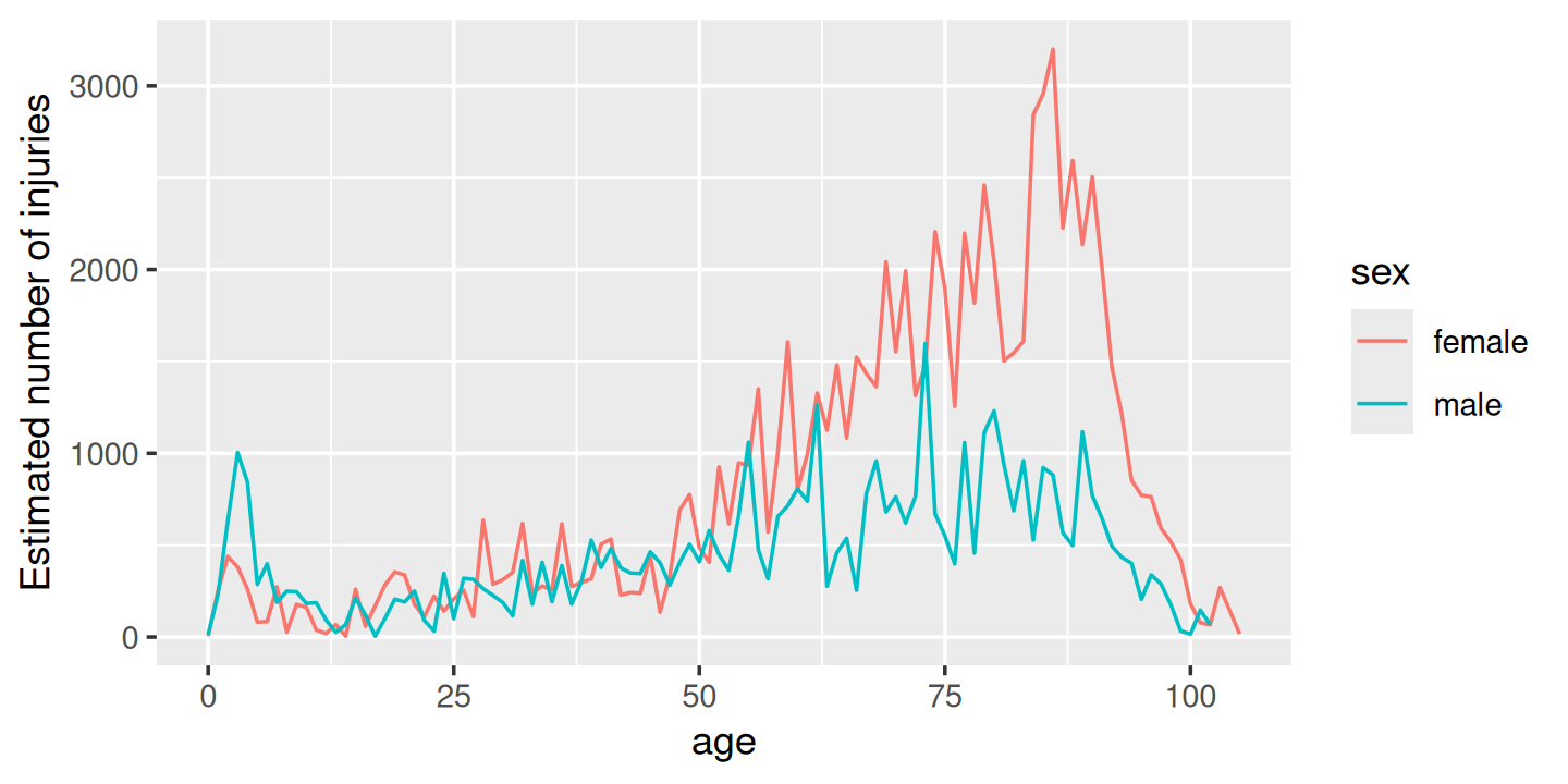
Figure 4.1: Estimated number of injuries caused by toilets, broken down by age and sex
We see a spike for young boys peaking at age 3, and then an increase (particularly for women) starting around middle age, and a gradual decline after age 80. I suspect the peak is because boys usually use the toilet standing up, and the increase for women is due to osteoporosis (i.e. I suspect women and men have injuries at the same rate, but more women end up in the ER because they are at higher risk of fractures).
One problem with interpreting this pattern is that we know that there are fewer older people than younger people, so the population available to be injured is smaller. We can control for this by comparing the number of people injured with the total population and calculating an injury rate. Here I use a rate per 10,000.
summary <- selected %>%
  count(age, sex, wt = weight) %>%
  left_join(population, by = c("age", "sex")) %>%
  mutate(rate = n / population * 1e4)

summary
#> # A tibble: 208 × 5
#>     age sex         n population   rate
#>   <dbl> <chr>   <dbl>      <dbl>  <dbl>
#> 1     0 female   4.76    1924145 0.0247
#> 2     0 male    14.3     2015150 0.0708
#> 3     1 female 253.      1943534 1.30
#> 4     1 male   231.      2031718 1.14
#> 5     2 female 438.      1965150 2.23
#> 6     2 male   632.      2056625 3.07
#> # ℹ 202 more rows
Plotting the rate, Figure 4.2, yields a strikingly different trend after age 50: the difference between men and women is much smaller, and we no longer see a decrease. This is because women tend to live longer than men, so at older ages there are simply more women alive to be injured by toilets.
summary %>%
  ggplot(aes(age, rate, colour = sex)) +
  geom_line(na.rm = TRUE) +
  labs(y = "Injuries per 10,000 people")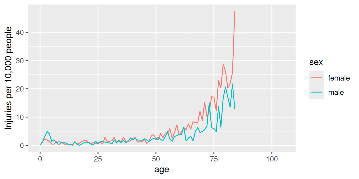
Figure 4.2: Estimated rate of injuries per 10,000 people, broken down by age and sex
(Note that the rates only go up to age 80 because I couldn’t find population data for ages over 80.)
Finally, we can look at some of the narratives. Browsing through these is an informal way to check our hypotheses, and generate new ideas for further exploration. Here I pull out a random sample of 10:
selected %>%
  sample_n(10) %>%
  pull(narrative)
#>  [1] "FACIAL LACERATION. 78 YOF FELL OFF A TOILET."
#>  [2] "60 YOF. ANKLE PAIN AFTER SYNCOPE WHILE SITTING ON THE TOILET & FELL ONTO THE FLOOR. DX: CLOSED FX OF DISTAL END OF RT FIBULA"
#>  [3] "43 YOM FELL OFF TOILET AT HOME AND HIT FACE CUTTING LT SIDE OF FACE DXFACIAL LACERATION*"
#>  [4] "84 YOF BECAME DIZZY AND FELL INTO TOILET. NO TRAUMATIC INJURY NOTED. DXDIZZINESS"
#>  [5] "CHEST WALL CT/59YOBF AT HOME FELL OFF TOILET & HIT HERSELF TWICE BEFORELANDING ON THE GROUND. FELL BECAUSE OF LOOSE TOILET SEAT."
#>  [6] "26YOM SEIZURE LIKE ACTIVITY WHEN URINATING AND FELL. HIT HEAD ON TOILET/ INJURY HEAD, CONVULSIONS"
#>  [7] "61 YOM TRANSFERRING FROM HIS WHEELCHAIR TO THE TOILET FELL BETWEEN THETOILET AND WALL SCRAPING HIS KNEE DX KNEE ABRASION"
#>  [8] "68 YOF SLIPPED WHILE TRANSFERRING FROM WHEELCHAIR TO TOILET.DX:  CONT BACK."
#>  [9] "86YOF H'TMA HEAD- FELL OFF BEDSIDE TOILET AT HOSPICE"
#> [10] "94YOM FELL OFF THE TOILET- STOOD UP AND LOST BALANCE AND FELL FRACTURED HIP FROM HOME"
Having done this exploration for one product, it would be very nice if we could easily do it for other products, without having to retype the code. So let’s make a Shiny app!
4.4 Prototype
When building a complex app, I strongly recommend starting as simple as possible, so that you can confirm the basic mechanics work before you start doing something more complicated. Here I’ll start with one input (the product code), three tables, and one plot.
When designing a first prototype, the challenge is in making it “as simple as possible”. There’s a tension between getting the basics working quickly and planning for the future of the app. Either extreme can be bad: if you design too narrowly, you’ll spend a lot of time later on reworking your app; if you design too rigorously, you’ll spend a bunch of time writing code that later ends up on the cutting floor. To help get the balance right, I often do a few pencil-and-paper sketches to rapidly explore the UI and reactive graph before committing to code.
Here I decided to have one row for the inputs (accepting that I’m probably going to add more inputs before this app is done), one row for all three tables (giving each table 4 columns, 1/3 of the 12 column width), and then one row for the plot:
prod_codes <- setNames(products$prod_code, products$title)

ui <- fluidPage(
  fluidRow(
    column(6,
      selectInput("code", "Product", choices = prod_codes)
    )
  ),
  fluidRow(
    column(4, tableOutput("diag")),
    column(4, tableOutput("body_part")),
    column(4, tableOutput("location"))
  ),
  fluidRow(
    column(12, plotOutput("age_sex"))
  )
)
We haven’t talked about fluidRow() and column() yet, but you should be able to guess what they do from the context, and we’ll come back to talk about them in Section 6.2.3.
Also note the use of setNames() in the selectInput() choices: this shows the product name in the UI and returns the product code to the server.
The server function is relatively straightforward.
I first convert the selected and summary variables created in the previous section to reactive expressions.
This is a reasonable general pattern: you create variables in your data analysis to decompose the analysis into steps, and to avoid recomputing things multiple times, and reactive expressions play the same role in Shiny apps.
Often it’s a good idea to spend a little time cleaning up your analysis code before you start your Shiny app, so you can think about these problems in regular R code, before you add the additional complexity of reactivity.
server <- function(input, output, session) {
  selected <- reactive(injuries %>% filter(prod_code == input$code))

  output$diag <- renderTable(
    selected() %>% count(diag, wt = weight, sort = TRUE)
  )
  output$body_part <- renderTable(
    selected() %>% count(body_part, wt = weight, sort = TRUE)
  )
  output$location <- renderTable(
    selected() %>% count(location, wt = weight, sort = TRUE)
  )

  summary <- reactive({
    selected() %>%
      count(age, sex, wt = weight) %>%
      left_join(population, by = c("age", "sex")) %>%
      mutate(rate = n / population * 1e4)
  })

  output$age_sex <- renderPlot({
    summary() %>%
      ggplot(aes(age, n, colour = sex)) +
      geom_line() +
      labs(y = "Estimated number of injuries")
  }, res = 96)
}
Note that creating the summary reactive isn’t strictly necessary here, as it’s only used by a single reactive consumer.
But it’s good practice to keep computing and plotting separate as it makes the flow of the app easier to understand, and will make it easier to generalise in the future.
A screenshot of the resulting app is shown in Figure 4.3. You can find the source code at https://github.com/hadley/mastering-shiny/tree/main/neiss/prototype.R and try out a live version of the app at https://hadley.shinyapps.io/ms-prototype/.
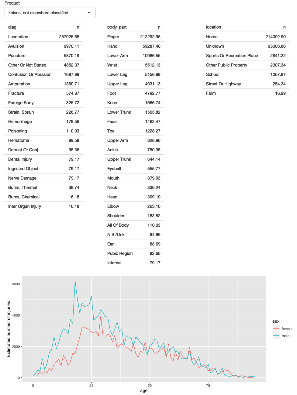
Figure 4.3: First prototype of NEISS exploration app
4.5 Polish tables
Now that we have the basic components in place and working, we can progressively improve our app. The first problem with this app is that it shows a lot of information in the tables, where we probably just want the highlights. To fix this we need to first figure out how to truncate the tables. I’ve chosen to do that with a combination of forcats functions: I convert the variable to a factor, order by the frequency of the levels, and then lump together all levels after the top 5.
injuries %>%
  mutate(diag = fct_lump(fct_infreq(diag), n = 5)) %>%
  group_by(diag) %>%
  summarise(n = as.integer(sum(weight)))
#> # A tibble: 6 × 2
#>   diag                        n
#>   <fct>                   <int>
#> 1 Other Or Not Stated   1806436
#> 2 Fracture              1558961
#> 3 Laceration            1432407
#> 4 Strain, Sprain        1432556
#> 5 Contusion Or Abrasion 1451987
#> 6 Other                 1929147
Because I knew how to do it, I wrote a little function to automate this for any variable. The details aren’t really important here, but we’ll come back to them in Chapter 12. You could also solve the problem with copy and paste, so don’t worry if the code looks totally foreign.
count_top <- function(df, var, n = 5) {
  df %>%
    mutate({{ var }} := fct_lump(fct_infreq({{ var }}), n = n)) %>%
    group_by({{ var }}) %>%
    summarise(n = as.integer(sum(weight)))
}
I then use this in the server function:
  output$diag <- renderTable(count_top(selected(), diag), width = "100%")
  output$body_part <- renderTable(count_top(selected(), body_part), width = "100%")
  output$location <- renderTable(count_top(selected(), location), width = "100%")
I made one other change to improve the aesthetics of the app: I forced all tables to take up the maximum width (i.e. fill the column that they appear in). This makes the output more aesthetically pleasing because it reduces the amount of incidental variation.
A screenshot of the resulting app is shown in Figure 4.4. You can find the source code at https://github.com/hadley/mastering-shiny/tree/main/neiss/polish-tables.R and try out a live version of the app at https://hadley.shinyapps.io/ms-polish-tables.
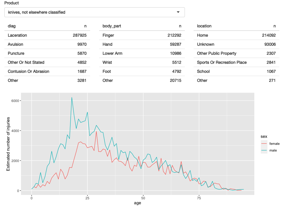
Figure 4.4: The second iteration of the app improves the display by only showing the most frequent rows in the summary tables
4.6 Rate vs count
So far, we’re displaying only a single plot, but we’d like to give the user the choice between visualising the number of injuries or the population-standardised rate.
First I add a control to the UI.
Here I’ve chosen to use a selectInput() because it makes both states explicit, and it would be easy to add new states in the future:
  fluidRow(
    column(8,
      selectInput("code", "Product",
        choices = setNames(products$prod_code, products$title),
        width = "100%"
      )
    ),
    column(2, selectInput("y", "Y axis", c("rate", "count")))
  ),
(I default to rate because I think it’s safer; you don’t need to understand the population distribution in order to correctly interpret the plot.)
Then I condition on that input when generating the plot:
  output$age_sex <- renderPlot({
    if (input$y == "count") {
      summary() %>%
        ggplot(aes(age, n, colour = sex)) +
        geom_line() +
        labs(y = "Estimated number of injuries")
    } else {
      summary() %>%
        ggplot(aes(age, rate, colour = sex)) +
        geom_line(na.rm = TRUE) +
        labs(y = "Injuries per 10,000 people")
    }
  }, res = 96)
A screenshot of the resulting app is shown in Figure 4.5. You can find the source code at https://github.com/hadley/mastering-shiny/tree/main/neiss/rate-vs-count.R and try out a live version of the app at https://hadley.shinyapps.io/ms-rate-vs-count.
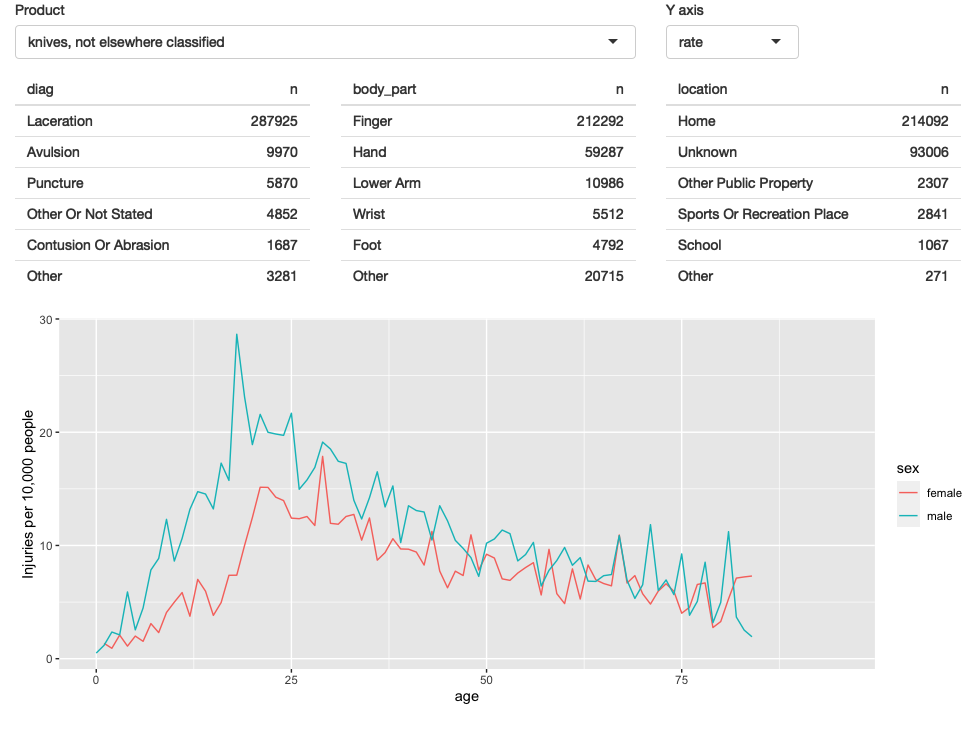
Figure 4.5: In this iteration, we give the user the ability to switch between displaying the count or the population standardised rate on the y-axis.
4.7 Narrative
Finally, I want to provide some way to access the narratives because they are so interesting, and they give an informal way to cross-check the hypotheses you come up with when looking at the plots. In the R code, I sample multiple narratives at once, but there’s no reason to do that in an app where you can explore interactively.
There are two parts to the solution.
First we add a new row to the bottom of the UI.
I use an action button to trigger a new story, and put the narrative in a textOutput():
  fluidRow(
    column(2, actionButton("story", "Tell me a story")),
    column(10, textOutput("narrative"))
  )
I then use eventReactive() to create a reactive that only updates when the button is clicked or the underlying data changes.
  narrative_sample <- eventReactive(
    list(input$story, selected()),
    selected() %>% pull(narrative) %>% sample(1)
  )
  output$narrative <- renderText(narrative_sample())
A screenshot of the resulting app is shown in Figure 4.6. You can find the source code at https://github.com/hadley/mastering-shiny/tree/main/neiss/narrative.R and try out a live version of the app at https://hadley.shinyapps.io/ms-narrative.
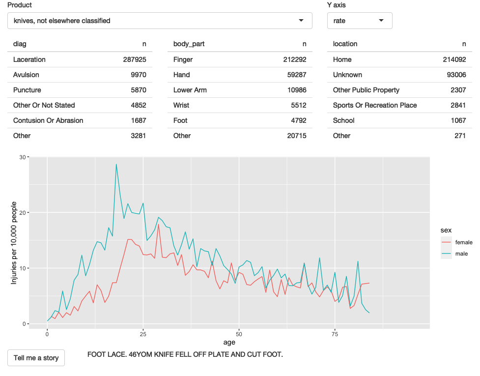
Figure 4.6: The final iteration adds the ability to pull out a random narrative from the selected rows
4.8 Exercises
Draw the reactive graph for each app.
What happens if you flip
fct_infreq()andfct_lump()in the code that reduces the summary tables?Add an input control that lets the user decide how many rows to show in the summary tables.
-
Provide a way to step through every narrative systematically with forward and backward buttons.
Advanced: Make the list of narratives “circular” so that advancing forward from the last narrative takes you to the first.
4.9 Summary
Now that you have the basics of Shiny apps under your belt, the following seven chapters will give you a grab bag of important techniques. Once you’ve read the next chapter on workflow, I recommend skimming the remaining chapters so you get a good sense of what they cover, then dip your toes back in as you need the techniques for an app.